In the quest of working with GatsbyJS more and more, I also tried styled-components during the rewrite of strandrover.com.
We used CSS Custom Properties to replace Scss variables, which might not be as backwards compatible as really rendering out the HEX values … but it's a lot cooler :D
Anyway, one thing that really bothered me, was that I wasn't able to use Mixins like in Scss.
One of my favorite Mixins of all times (just meassured by the amount of projects through which I already dragged this …) is this brilliant piece from CSS Tricks:
@function strip-unit($value) {
  @return $value / ($value * 0 + 1);
}

@mixin fluid-type($min-vw, $max-vw, $min-font-size, $max-font-size) {
  $u1: unit($min-vw);
  $u2: unit($max-vw);
  $u3: unit($min-font-size);
  $u4: unit($max-font-size);

  @if $u1 == $u2 and $u1 == $u3 and $u1 == $u4 {
    & {
      font-size: $min-font-size;
      @media screen and (min-width: $min-vw) {
        font-size: calc(#{$min-font-size} + #{strip-unit($max-font-size - $min-font-size)} * ((100vw - #{$min-vw}) / #{strip-unit($max-vw - $min-vw)}));
      }
      @media screen and (min-width: $max-vw) {
        font-size: $max-font-size;
      }
    }
  }
}
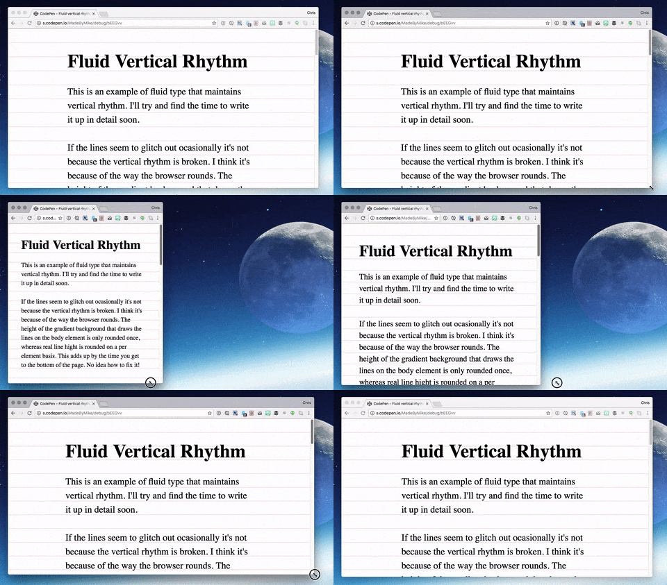
What that does is this:

Basically setting the font-size to a viewport unit like 5vw BUT it also let's specify a min and max font size in px.
The same thing in styled-components
Getting directly to it: I wanted that same thing in styled-components!
What I did till now, was to make a new mixins.js file and dump this in there:
export function flexUnit(amount, min, max, unit = 'vw', prop = 'font-size') {
  const minBreakpoint = (min / amount) * 100
  const maxBreakpoint = max ? (max / amount) * 100 : false
  const dimension = unit === 'vw' ? 'width' : 'height'

  return `
    @media (max-${dimension}: ${minBreakpoint}px) {
      ${prop}: ${min}px;
    }

    ${
      max
        ? `
      @media (min-${dimension}: ${maxBreakpoint}px) {
        ${prop}: ${max}px;
      }
    `
        : ''
    }

    ${prop}: ${amount}${unit}
  `
}
Which you then can use like so:
const StyledHeadline = styled.h2`
  h2 {
    ${flexUnit(5, 32, 60, 'vw', 'font-size')}
  }
`
In which 5 means 5vw, 32 and 60 and treated as px and are the respective min and max. The vw and font-size are in fact already fallsbacks in the function and just there to illustrate that you could also use this on padding or any other CSS property that supports viewport units.
Enjoy.